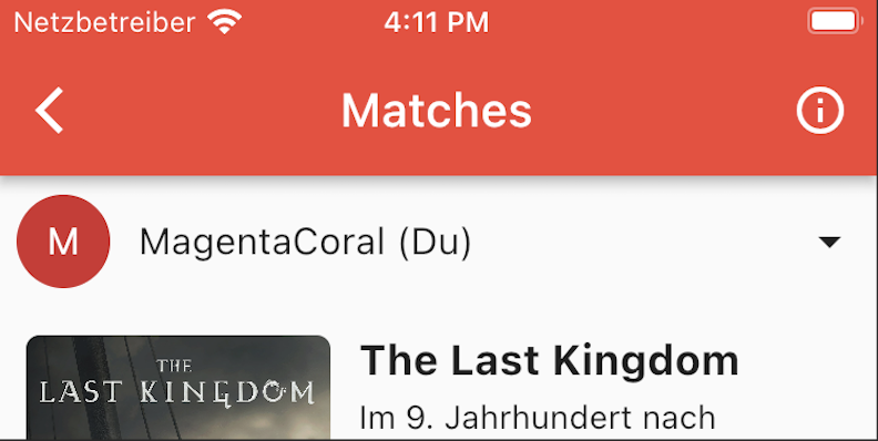
Lastly, I have adjusted the list of matches. Here I tried a flat design based on the Material Design 3 and replaced the cards with shadows/elevation by simple and flat list elements. I also shortened the descriptions and headings to uniform lengths to get a neat structure.
Then I added a page for privacy, imprint, terms and conditions and the data source to meet all requirements here as well. You can find these now on the Matching page , if you click on the “i” icon.

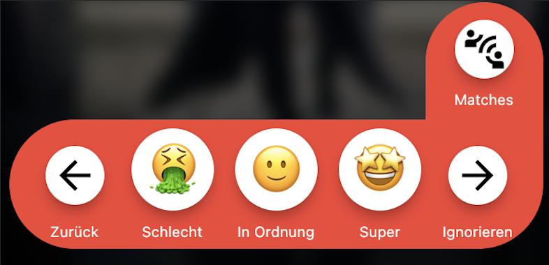
We also integrated the button of the matching page into the rating bar. This makes it look much more coherent when looking through the individual movies and series. The design is remotely reminiscent of origami, which I find very refreshing and positive, and emphasizes a bit of our own design.

After all the work and polishing of the app, we ventured to the Google PlayStore and the Apple App Store and submitted a first version for review.
Google waved us right through and was happy with the app. Unfortunately, Apple was less easy. They are not happy with the integration of the trailers, although we have seen other apps that were able to release it exactly the same way in the App Store. Magic?!
After a short crisis meeting we decided to continue and analyzed the integration of the trailers again and looked for new options.
There must be a simple solution and the project should not be stopped because of that.
After a short research we decided to load the trailers in a WebView by clicking on the cover image. The whole thing happens on an extra page within the app and with an obvious load in a web browser. So that we don’t completely destroy the UX by switching to a different app/web browser with each new title.
It always remains exciting to guide an app through Apple’s App Store review. Let’s hope it works this time and the application can finally be unleashed on humanity.
Status: Waiting for Review.